
Understanding your top line results
Aampe's top focus is your bottom line. 📈
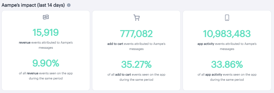
When you log into the composer, you'll see these metrics cards right at the top of your page:
NOTE: These tables won't show up right away!If you're just starting off with Aampe, this data won't show up until after your messages start sending.
It's also worth noting that these numbers represent a 14-day rolling average, so, until the "14-day bucket" is full, the percentages will look artifically low (e.g., If we've only been messaging for five days, but we're comparing to a 14-day rolling average of all purchases, it shouldn't be surprising that the percentages look low in comparison.)
Not to worry! The data will be accurate in 14 days. 👍
Here's where these metrics come from and how they're calculated:
Where they come from:
When you configure your events (under 'Configure > Events' in the left side nav, you categorize your imported events into one of four buckets (Click, General Engagement, Add to Cart, and Revenue).
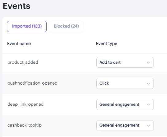
Note: You can change the names of these events in the Event Manager (e.g., You can call them "Lesson Completed" or "Cashback Redeemed," etc.) I'll add a doc outlining the event configuration process soon! 😅
☝ These categorized events are what we use to construct this table.
How they're calculated
As the heading of the table states, these are Aampe-attributed events, so we use the following process to understand our attribution:
- We take a count of all of the target events that happened within an attribution window of a user receiving a message. (⏳ By default, the attribution window is set to 24 hours. If you require a different attribution window, please let us know at [email protected].)
- We compare that performance to users who didn't receive a message (You can find more detailed information about how our control group functions here.)
- We report only the events that occurred within the attribution window, above and beyond the control group performance.
Now you can see, at a glance, Aampe's impact on your key metrics vs. a control group.
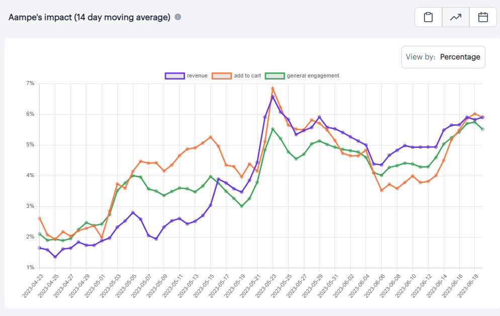
Want to see these trends over time? We got you!We included a toggle at the top of the graph that lets you see these same events plotted on a graph, so you can see Aampe's impact over time!
Do you have any questions on your homepage metrics? We'd love to hear from you! Please reach out at[email protected]!
Updated about 2 months ago
Looking for ways to improve your topline metrics? Check out the Live Messages view to find out how!