
Uncovering your macro user preferences
What macro trends are resonating with your users?
Are you writing a new ad, email, or webpage and want to know what themes are currently resonating with your users?
The Personalization Manager is here to help! 🦸♂️
(To get to the Personalization Manager, simply click on "Personalization" on the left side nav bar.)
When Aampe sends messages, we track the performance of those messages, but we also track the performance of the individual labels you've created.
The Personalization Manager allows you to see and sort the performance of these labels against each other to see larger trends. (This is also why a good labeling strategy is so important! 💡).
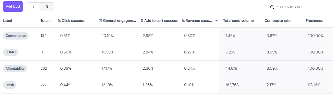
Here's an example of a snippet from a completed Personalization table:
NOTE: Your table might not be populated right away!If you're just starting off with Aampe, this data won't show up until after we process the results from the previous day.
After you hit "Start sending," your messages are scheduled for delivery the following day. Then, after your messages send, we need to wait until your next data dump to see the results (for most customers, this is the following day, for a total of approximately 48 hours after the initial "Start sending" click event).
Not to worry! The data will be populated as soon as we receive the results of the previous send (plus a little processing time). 👍
Here's how to read this table:
Mind the toggle!The toggle at the top (Near the purple "Add label" button) let's you switch between viewing percentages and counts. 🤓
You can also sort by each column to see, for example, which labels are driving the most Clicks and which are driving the most Revenue events (You might be surprised to learn that they're not always the same!)
Also note that these values represent a 7-day rolling average.
Total Content
- This shows the total number of message variants associated with each Label so you can be sure your most popular Labels have enough variant coverage!
%/# Click success
- The percentage/number of the messages sent with this label that resulted in a successful "Click event" (as defined by your event configuration)
%/# General engagement success
- The percentage/number of the messages sent with this label that resulted in a successful "General Engagement event" (as defined by your event configuration)
%/# Add to cart success
- The percentage/number of the messages sent with this label that resulted in a successful "Add to Cart event" (as defined by your event configuration)
%/# Revenue success
- The percentage/number of the messages sent with this label that resulted in a successful "Revenue event" (as defined by your event configuration)
Total send volume
- The total number of times this label was sent (rolling by week)
Composite rate
- The composite rate is a helpful metric that's a weighting of your Click, General engagement, Add to cart, and Revenue success rates. Sorting by this metric can help you uncover unique insights, like Labels that have disproportionately high Revenue success rates even though the Click success rates may be low.
Freshness
- The Freshness score can help you understand when the variants attached to your Labels are getting stale and could use some refreshment before they start to get redundant.
Beware of low Freshness scores!A low freshness score indicates that your users are getting messaging that's beginning to sound redundant. Obviously a Freshness score of 100% is ideal, but best practice is to keep this number above 75%.
Here are a few examples of insights that can be gathered from this table
- The "Affordability" label results in a slightly higher CTR than the "Convenience" label, but the "Convenience" label leads to a higher percentage of revenue success.
- Both of these labels were much more effective than the "Happiness," "Quality," and "Authority" labels (not pictured), which still drove clicks, but had less than a 0.05% revenue success rate.
- Even though the "Fresh" label wasn't as effective as the "FOMO" label, it was sent 56x more often! This could be because the "Convenience" messaging is more effective, but only for a niche market, or just because you simply have many more "Fresh" variants available.
But knowing which Label is performing best is only one piece of the puzzle —
You'll also want to know what particular messaging variants are associated with that label, so you can integrate them into your other marketing and media.
Just click on any of the Labels, and a handy sidebar will pop up showing you the variants associated with that label, as well as the Message Group that particular snippet is associated with:
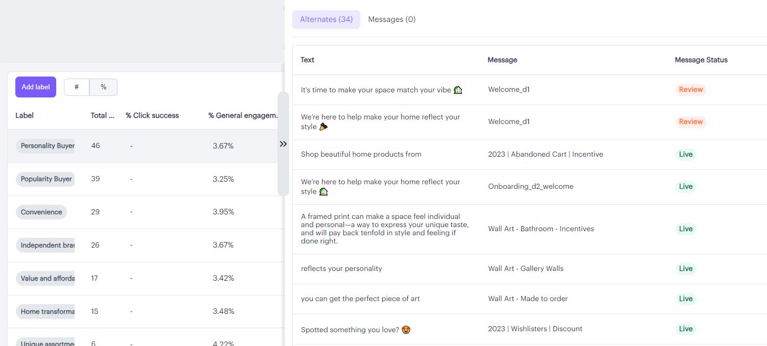
Just click on the associated snippet to be taken to the actual message, or click on the arrows to collapse the view.
Now you know what messaging is resonating with your users right now!
Remember to check the Personalization Manager regularly!Times change and people change too! Regularly checking the Personalization Manager to see what themes are currently trending with your users will help ensure that your messaging is always on point and not getting stale!
Have any questions on the Personalization Manager? We'd love to hear from you! Drop us a note at[email protected] with any questions!
Updated about 2 months ago