
Using the Live Messages View
See which messages are 🔥 and which are 📉
With Aampe, your messages aren't stuck in rigid journeys or just sent one time and discarded, they're continuously being used and reused as our model determines a particular message will resonate with a particular user at a particular time.
...and that lets us do some awesome things to understand message performance.
Enter: The Live Messages View
(To access the Live Messages view, simply click "Live Messages" on the left side nav bar.)
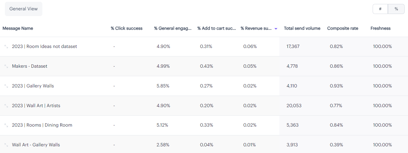
The live messages view stacks the current performance of all of your messages against each other and allows you to sort by results like CTRs and Revenue events attributed to each message.
Here's an example of a populated Live Messages table:
NOTE: Your table might not be populated right away!If you're just starting off with Aampe, this data won't show up until after we process the results from the previous day.
After you hit "Start sending," your messages are scheduled for delivery the following day. Then, after your messages send, we need to wait until your next data dump to see the results (for most customers this is the following day, for a total of approximately 48 hours after the initial "Start sending" click event).
Not to worry! The data will be populated as soon as we receive the results of the previous send (plus a little processing time). 👍
Here's how to read this table:
Mind the toggle!The toggle at the top right let's you switch between viewing percentages and counts. 🤓
You can also sort by each column to see, for example, which messages are driving the most Clicks and which are driving the most Revenue events (You might be surprised to learn that they're not always the same!)
Also note that these values represent an average of the results from the current week's message sends. The values reset every week, so check them often because they will change!
Here's a quick explanation of each of the column headers:
%/# Click success
- The percentage/number of the messages sent which resulted in a successful "Click event" (as defined by your event configuration)
%/# General engagement success
- The percentage/number of the messages sent which resulted in a successful "General Engagement event" (as defined by your event configuration)
%/# Add to cart success
- The percentage/number of the messages sent which resulted in a successful "Add to Cart event" (as defined by your event configuration)
%/# Revenue success
- The percentage/number of the messages sent which resulted in a successful "Revenue event" (as defined by your event configuration)
Total send volume
- The total number of times a message was sent (cumulative by week)
Composite rate
- The composite rate is a helpful metric that's a weighting of your Click, General engagement, Add to cart, and Revenue success rates. Sorting by this metric can help you uncover unique insights, like messages that have disproportionately high Revenue success rates even though the Click success rates may be low.
Freshness
- The Freshness score can help you understand when your messages are getting stale and could use some refreshment before they start to get redundant.
Beware of low Freshness scores!A low freshness score indicates that your users are getting messaging that's beginning to sound redundant. Obviously a Freshness score of 100% is ideal, but best practice is to keep this number above 75%.
Here are some example questions/actions that can be gathered from this table:
- Which message is driving the most revenue events?
- Is it also driving the most clicks, or should you update the hook to be a little catchier?
- Is there a message that's getting a great CTR, but poor conversion rate?
- Make sure the message has a relevant deeplink, so it's easier for your customer to convert after they tap!
- Is the Freshness score for some of your messages getting low?
- Pop in and add some more variation to keep them fresh!
But it's not enough to only know that a message is performing well — We also want to know why it's performing well!
...and Aampe has made this easy for you to do too!
Click on any of your messages, and a new screen will load, showing all of your different variants and their relative performance:
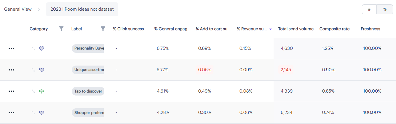
This can help you discover any outliers in your messaging (e.g., if one label is performing significantly better or worse than another).
If there is a label you'd like to explore further, you can click on the little expander arrows toward the left side of the table to reveal your variants that are associated with that label and their relative effectiveness:
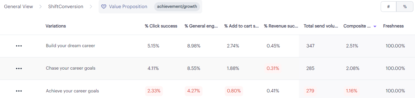
Check it out! 🔎Notice how "Build your dream career" drove double the clicks as "Achieve your career goals," but drove a very similar number of revenue events.
"Chase your career goals" got a similar CTR to "Build your dream career," but drove the smallest number of conversion events.
If you were going to run an ad to acquire new users, "Build your dream career" would be your best copy choice!
What's with all the red highlights?Our system automatically highlights your lowest values in red to help you easily identify which message, label, or variant is performing worst in each category.
You don't necessarily have to do anything with this information, but you may want to consider adding new variants or modifying your most underperforming variants to try to increase your overall metrics.
NOTE: Just because a variant is "underperforming" doesn't necessarily mean you should delete it. Some variants perform poorly in the general population, but perform exceptionally well for smaller portions of your population. Again, the goal is just to bring these "poor performers" to your attention so you can make intelligent decisions about how your messages can be improved.
Have any questions on the Live Messages view? We'd love to hear from you! Drop us a note at[email protected] with any questions!
Updated about 2 months ago
Want to drill deeper into macro user trends? Check out the Personalization Manager next!